General Business: What do you look for in a blog design?
1 to 17 of 17
-
Getting my blog design revamped.
Simple question: What do you look for in a blog design?
Is it cleanliness (ie. a lot of white space), loads of colour, whackiness, highlighting the best posts, well placed monetization, no monetization, a nice logo, small font, bigger font, loads of pics etc etc.
Also in what order would you rank these for importance?
Blogtrepreneur.com - Entrepreneur Blog
Thanks in advance,
Adnan -
1. Clean design. It doesn't have to be white space but space without clutter.
2. Good looking design.
3. Usability: How easy it is to find out and understand how and what is going in the blog
4. Pics
5. Interaction
Phoenix, AZ Foreign Language Lessons - Tutoring Indianpolis, IN web design -
Thanks Aaron. Any more ideas guys?
Blogtrepreneur.com - Entrepreneur Blog -
Make it easy to access your best content.
Make it easy to access anything.
I'm Ross Hill from Thrive Web Marketing. -
very easy on the eyes, and have visuals with your texts, ygg's blog seem to do that right....
if its a big lump of text with no pic i wont read it at all...
-
I look for designs that support the blog's content rather than being the main focus.
Kineda - Entertainment, Pop Culture, and Lifestyle -
Posted By: kineda
I look for designs that support the blog's content rather than being the main focus.
Ditto
Proud Founder of YGG -
Make the content the focal point, the comments easy to digest, the navigation complimentary, and the advertising passive.
Proud Partner of YGG -
OK thanks for all the great input guys - will be passing this onto my designer. Anymore for anymore? Watch this space as I'll be posting about the new design when its done.
Blogtrepreneur.com - Entrepreneur Blog -
It'll probably be easier for everyone to just give feedback throughout the process. If you throw up a comp or two in the early stages of design we might be able to give some more direct and better advice.
Proud Partner of YGG -
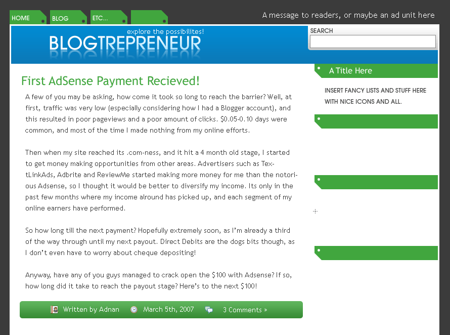
OK Thats a better idea. Here are two mockups that he did. The first is an older one, and the second is more recent.
http://www.golfchum.com/idea4.gifhttp://www.golfchum.com/idea1_rev1.gif
Feedback much appreciated.
Blogtrepreneur.com - Entrepreneur Blog -
I think I like the green/blue one better
Proud Founder of YGG -
I like the green and blue one better but the design needs cleaned up. There a lot of sharp edges and hard lines.
See you can soften it up a little.
Phoenix, AZ Foreign Language Lessons - Tutoring Indianpolis, IN web design -
I like them both, I guess the blue/green is better. Although "Recieved" is spelled "Received" ;)
My Personal Finance Blog -
Lol - that wasn't me!!!
I think the designer was just rushing so he could put some content to show on the design.
Things are going smoothly on the design - I've got a new catchphrase..."Blogtrepreneurship redefined". You like?
Blogtrepreneur.com - Entrepreneur Blog -
How about "money in your mind" - but now that I've said that, it's trademarked and you'll have to pay me royalties to use it.
Proud Founder of YGG -
Lol yeah I quite like it - but Blogtrepreneurship defined looks real good with my new logo. I can't post the logo but you'll probs agree when u see it.
And Eric - Im sure you wouldn't charge a good buddy royalties now would you? ;)
Blogtrepreneur.com - Entrepreneur Blog
1 to 17 of 17