

Welcome, Guest
Feeds
LiveSearch
Categories


 PPC Management
 Hell Yeah Dude!
 Reverse Funnel System for Beach Bums
Ideas & Concepts: New Logo Concept
1 to 15 of 15
-
- CommentAuthorchris.pund
- CommentTimeJan 24th 2007 edited
I am going to be launching a new service website in the next couple weeks and wanted to get some feedback on the logo. I put it together tonight during my digital imaging class since I was done way early with the assignment.
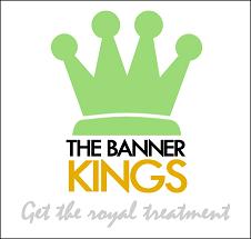
I feel like the crown is a little over powering and outweighs the rest of the logo (the text) yet I want it to be large enough to cover the top line of text "THE BANNER" so that it goes from edge to edge as it just about does.
Thoughts?
Dorm Room Biz -
It looks lopsided to me a bit, but yeah it should cover "THE BANNER". I don't like the font for the tagline though, too common - try something different. Otherwise, looks good. 2.0ize it with some gradients and reflections and you too could be a million dollar acquisition (just kidding, of course), though I am a fan of web 2.0 logos.
Proud founder of YGG -
I took a minute to revise it a bit. I think this makes it a little better, still a bit off, but better in my opinion.
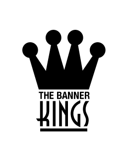
I'd scrap the tagline. Its a bit too punny.
Proud Partner of YGG -
I think it needs some color. I think a tag line could draw more attention but you could come up with something good later
Phoenix, AZ Foreign Language Lessons - Tutoring Indianpolis, IN web design -
I like it Travis
Proud founder of YGG -
Posted By: letutor
I think it needs some color. I think a tag line could draw more attention but you could come up with something good later
I never use any colour when mocking up logos. That comes later. Any palette can be added to that once the details are worked out.
A tagline never hurts, but you're better off without one if you can't come up with a unique and memorable line.
Proud Partner of YGG -
I like Travis' version... nice.
My Personal Finance Blog -
Travis is the man, he pushed me to learn photoshop inside out. By-the-way... Travis, i know about 90% of it now... ready to battle? hahaha.
-
- CommentAuthorchris.pund
- CommentTimeJan 24th 2007
Thanks for the comments guys. I'm gonna work on it a little more tonight and see what I can come up with. Travis, I like the direction you started going on and Ive got an idea to go off of that. I also do what to change the font up on KINGS as you did, I was a little limited to the fonts on the university owned computers at the time. Ill post back with an update later.
Dorm Room Biz -
Cool. I just wanted to push yours a little more. Still could use a concept tying the crown and banners together. Think about that and see where you can take it.
Remember, never show what you say and never say what you show. Apply that to the logo and tagline, they'll jump from good to great.
Proud Partner of YGG -
Posted By: letutor
huh?
Hahahahahahaha.
What I was trying to say is there's no visual representation of banners. There are many things people associate with the web that could be tied into the crown.
The never say what you show........... that's a rule where if your company name is Tall Apple, don't incorporate a tall apple into the logo. That closes the loop without leaving you any room to participate.
Comprende? lol
Proud Partner of YGG -
LOL
Proud founder of YGG -
- CommentAuthorchris.pund
- CommentTimeJan 25th 2007
Travis - do you mind emailing me the font that you used for KINGS. I used to have it but since I whipped my computer a couple weeks ago, I don't have it anymore.
Dorm Room Biz -
- CommentAuthorchris.pund
- CommentTimeJan 30th 2007
I think this is what I am going to go with. I haven't had too much time over the past few days to play with the design, but I am happy with this and want to move onto the site and getting close to launching it. I may come back to it once the site is designed and rework it a little depending on how things work out.
Dorm Room Biz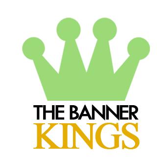
1 to 15 of 15


